If you don't want to create your own, How About Orange posted recently about blog headers available for free download here. There are a lot of options there so it's worth taking a look.
How to Create a Blog Banner
Step 1:
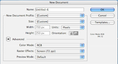
In Adobe Illustrator, open a new document. Choose "Web" for Document Profile. Set the width to 700 px and Height to 250 (or 200) pixels. (I found that 600 to 700 pixels wide works best with Blogger.)
Step 2:
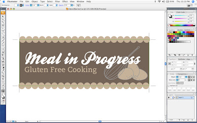
Design your banner. Easy right? This is the kind of stuff I do at work all day. My quick tips are choose fonts and colors that are appropriate for your blog. Here, I used two shades of brown, grey and white. Likewise, my Lula Louise banner only uses two colors and white. To make the pattern I just used squares turned rotated 45 degrees. Finally, make sure there is a focal point. Whatever you want to see first, make it biggest and brightest.
Most importantly, don't overdo it and don't sweat it. If you like it, that's all that matters.
Step 3:
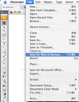
When you're done designing, go to the file menu and select "Save for Web and Devices".
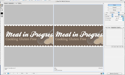
 Choose settings to create a small file size and retain image quality. File size and upload time is shown at the bottom of the screen. Click the save button and follow the steps to save. (This part is the same in PhotoShop.)
Step 4:
This final part is only for Blogger users. Login and click the Layout tab. Click the "Edit" button in the header section. Upload your image and under "Placement" select "Instead of title and description". I use the Minima template for my blog. To keep from having a grey outline around my header I next change the Fonts and Colors. In the scrolling menu at the top left, scroll down to "Border Color" and select it. Next, select the color white. Finally, click "Save Changes".
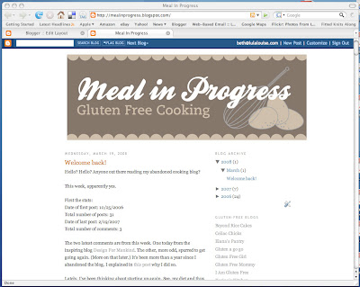 View your new fancy pants blog.

I love your banners, and I'm really new to photoshop, so I've only used photos+font in creating my banners. It's probably a lot of explanation/work, but how do you incorporate illustrations like your eggs and wisk? Are they your own drawings? I love that look. Thanks for sharing your expertise!
ReplyDeleteHow do you save screenshots? Is it through Illustrator or your computer?
ReplyDeleteYOU ARE the BEST!! Thanks so much for responding to my request so prompt and quick. You are so talented!
ReplyDeleteKayla_d: I used Illustrator to draw the eggs and whisk. I drew lines and shapes and kept playing with the colors until I got something I liked. I've been using Illustrator for a number of years now so I'm pretty comfortable with it. I prefer using it to draw over Photoshop.
ReplyDeleteTina: I have a mac and used the program Grab that comes with the computer to take the screen shots.
Valerie: Thanks and you're welcome. You made the suggestion at a really convenient time.
thank you so much, I will be making one promptly!
ReplyDeleteI've seen almost all of your posts and you are a genius! Anyway, if I don't have Adobe Illustrator, can I still use Adobe Photoshop instead? Thank you so much for your help!
ReplyDeleteThanks nnnisa! You can use PhotoShop to create a web banner but it's harder to do drawings. PhotoShop also has a save for web feature which will really bring down the file size.
ReplyDelete