Showing posts with label instagram. Show all posts

Follow me on Instagram


Hi Friends! I started a new Instagram account over the weekend. (I know. I'm kind of crazy.) I've had one for about a year and half that chronicles my day to day journeys. And I love that account and my photos there but it focuses more on building, landscapes and the occasional food shot. I felt like my DIY projects didn't really fit in there so I've created a new place to do just that. I hope that you'll follow me @LulaLouiseDIY and stay up to date on all my DIY adventures. xoxo, Beth

--
Follow along with me here:

Font Friday – Aleo Font and Instagram Pics

Today's Font Friday pick is a classy slab serif called Aleo, available for free on Behance. The font is available in six 3 weights, each with a regular and italic (6 total! pretty rad). Aleo is a classy, stand up kind of font, perfect for captioning my favorite Instagram pics of the week.

Weekend Photos - Palm Springs


This weekend I escaped to Palm Springs for a little getaway. I got some good relaxation time and a bit of touristing. The temperature was about 90 degrees. If that was different than the average in LA, it would definitely have felt like a vacation. The weekend is never long enough but it was really nice to get out of town for a bit.


The photo group at the top is a combination of instagram photos and Canon Rebel/Photoshop. The one above is a photo that I adjusted using the app TaDaa. It's free to download and a lot like instagram but with more control over blurring and some additional filters. There are probably more differences that I haven't discovered yet. You can see all my TaDaa photos here.

Friday Faves – Sanchez Font and Instagram Photos

Today's Font Friday is Sanchez from My Fonts. Sanchez is a lovely, clean slab serif font. This font is similar to a classic slab serif like Rockwell but has a few special curves added in. Be sure to check out the "K" and "Q". The Regular and Italic versions are available for free. Buy the whole family and you'll get Extra Light, Light, Semi-Bold, Bold and Black, all in regular and italic. You can't get much more complete than that. Oh wait you can, there's also a Sanchez Condensed family.

For more font inspiration follow #FontFriday on twitter. You can follow me on twitter too. You should also check out this article about Hipster Typography from Font Shop. Very interesting. Now on to some examples of how I might use Sanchez in a design.

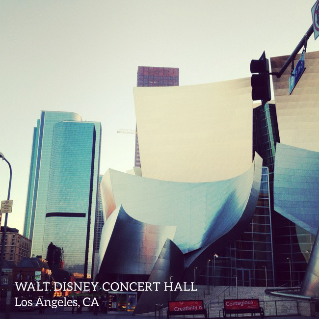
These are all photos that I took using my iphone and posted on Instagram (you can follow me @bethwould). Instagram is probably my favorite social media. It allows one to share while being visually creative.

ROCKTOBER BABY! Maybe better than Oktoberfest? Rocktober lasts longer right? Anyway, I took this photo at The Black Keys concert at The Staples Center.  Lots of fun!

OK, last example. I love the the composition of this photo and all the different elements – peeling paint, tiles, numbers, metal, red bell. And if you don't recognize the song lyric you need to listen to this song immediately. It sounds cooler in your head if you have the tune to go along with it. Have a great weekend!!

Friday Faves – September 14

You Make My Dreams Come True Poster

I'm Loving in Veneer font

This week's Friday Font is Veneer from My Fonts. Veneer is an awesome, grungy cool all-caps font. Veneer comes in three "weights", italic and dingbats. The weights are really just different levels of grungy distrress. And (bonus!) the dingbats are available for free. Can't get enough font inspiration? Follow #FontFriday on twitter.

This week I wanted to show you how I would use this font. So, I did a little designing. Inspired by this song, I designed the graphic above using veneer and its dingbats. I layered the letters and dingbats over paper (available for free from Fudge Graphics) using different transparencies. Pretty cute right? If you need more design inspiration, check out my design board on Pinterest.

Or, if you want to combine Veneer with some photos, you could layer it over your favorite Instagram shots. I took these photos during a trip to Madison, Wisconsin last weekend. The two above are from the University area and the ones below are from the lakes and arboretum that the town is built around.

You might be wondering how I get such intense colors in my Instagram photos. First, I take a photo using the iphone camera, then I edit it in the app Aviary to increase saturation and sharpness. Finally I load it in Instagram and filter it. It takes longer but I really like the intensity of the photos.

For these collages, I used the PicStitch app to make the photo grids. Then I added the text and dingbats in PhotoShop. If you want to stay up to date on my Instagram photos, follow me at @bethwould or on flickr. Have a great weekend everybody!!! Happy creating/crafting/making!

I'm on Instagram!

I joined Instagram this weekend. Although I'm still learning, it is as much fun as I expected it to be. I'm posting the photos to my flickr account (which seems to be the easiest way to follow along). I really enjoy the immediacy of being able to pull out my phone, take a snapshot and send it out to the world. Most of the time, I'd rather communicate with pictures than words anyway. Also putting the effects on my photos is pretty fun. It can make an ordinary picture a little extra special. Are you on instagram? What do you think?